Leaf (Fantagrahics Books)
Creator: Daishu Ma
This is the Page 45 Comic Book of the Month for September '15 and the image of the cover does not do justice to the sheer beauty of this book. It's a lovely hardback, with the logo seen through a leaf-shaped cut out in the cover. This is a wordless comic and it is one I'm really looking forward to curling up with as we enter that best of seasons, autumn. Sat in a chair with the leaves falling in the garden outside, and a nice steaming mug of hot chocolate to hand, this book open on my lap. A quick glance at the interior shows that, aesthetically at least, it pushes all the right buttons.
Loki Agent of Asgard #17 (Marvel)
Writer: Al Ewing
Artist: Lee Garbett
Colour Artist: Antonio Fabela
Letters: Clayton Cowles
This has been a fantastic series but looking at the editorial on the back page, this is the concluding issue. A great shame and this is a comic I'm really going to miss. Still better to go out whilst it is still on top form and the creators have not tired of it. There is one thing I'm certain of and that is the creators will deliver a conclusion that satisfies on every level. I've every faith in them.
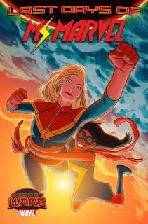
Ms Marvel #17 (Marvel)
Writer: G. Willow Wilson
Artist: Adrian Alphona
Colour Art: Ian Herring
Letters: Joe Caramagna
Cover: Kris Anka
This is the other super-hero comic that I get regularly every month, and shares with Loki a sense of fun. Last issue Carol Danvers had turned up to lend a hand so it will be interesting to see how Kamala handles meeting her hero. This comic has not once let me down in the previous sixteen issues in terms of the entertainment it offers. Young and modern with a strong female lead, this shows just how good this genre can be. The fact that the likeable young hero is also a Muslim, realistically portrayed, adds an extra layer of meaning and importance which never turn didactic.
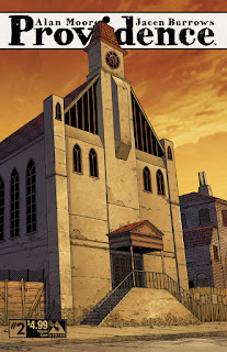
Providence #3 and #4 (Avatar)
Story: Alan Moore
Art: Jacen Burrows
Colour: Juan Rodriguez
Letters: Kurt Hathaway
I'm a huge Lovecraft fan and was first turned onto him when Alan Moore mentioned the writer as a key influence in an interview sometime in the mid-eighties, so I had high expectations when this series began to be publicised. The first two issues have not disappointed. This is a dense read, with a lot of allusions to various Lovecraft stories, and a huge amount of information that helps place you in this world (there are quite long text excerpts from the protagonist's journal at the end of each of the first two issues. Given the rather understated covers we have had, I'm rather disappointed with the cover to issue three and the picture of Dagon rising out of the water. Lovecraft is at his strongest when the horrors are hidden just out of sight, when you can feel there is something slightly out of kilter with the world but can't quite place it. Still I'm hopeful the interior will continue the high standards set so far.
Rachel Rising #36 (Abstract Studio)
Creator: Terry Moore
A lovely cover, as ever with Terry Moore. Each of these issues just flies by when your reading it, so that you are surprised when you get to the end so quickly, and a little disappointed that you now have to leave the world he has created for another six weeks. He has the knack of making you want more every time, a trick he established quite early on in Strangers in Paradise and has perfected through Echo and now Rachel Rising. There was a point some time ago when it looked like he wasn't going to be able to carry on with this title as it was not economically viable. Now we are onto issue thirty six I'm really hoping that things have turned around because comics of this quality are always needed.
The Fade Out #8 (Image)
Creators: Ed Brubaker and Sean Phillips
Colours: Elizabeth Breitweiser
This is Ed Brubaker and Sean Phillips. What more needs to be said? I think they are in the upper echelons of creative teams working in English language comics today. In thirty years time I think we'll be looking back on them and their work with the same regard comics fandom has for Lee and Kirby and their run on Fantastic Four (a regard I don't share but that's a purely personal issue). This is lovingly packaged with an image of a still from a film at the back which helps make this world they've created all the more believable.
Velvet #11 (Image)
Writer: Ed Brubaker
Artist: Steve Epting
Colours: Elizabeth Breitweiser
Ed Brubaker again, this time with Steve Epting. I think we are now entering the conclusion of the story that started in issue one, and hopefully by the end of this arc we will have a lot of our questions answered. I don't know if it will work out well for our heroine. I hope it does but I don't expect it will do. That just wouldn't fit the overall tone and I think Velvet may well be left more emotionally damaged than she was at the start. On a personal note I had a quick glance at the letters page and the letter I sent a while ago has been printed. The internet is fine but there's nothing like seeing your name in print in the actual comic to make you grin all over like a loon.
Sunny Volume 5 (Viz Media)
Creator: Taiyo Matsumoto
Volume one was a Page 45 Comic Book of the Month and I'm so glad it was as it introduced me to one of the most entertaining, moving comcs I've read. If you think of manga as all constant action-oriented, fast paced stuff the this will change your mind. It's about an orphanage in Japan where children are sent, not because their parents have dies, but because their parents don't want them or can't cope with them anymore. The concept sounds sad but instead results in really inspiring tales. There is no melodrama here, and there are no dire threats to the kids. These are tales of the childen's emotional ups and downs in their day-to-day lives and its wonderful.


