Art: Jacen Burrows
Colour: Juan Rodriguez
Letters: Kurt Hathaway
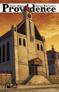
Issue two of Alan Moore and Jacen Burrows' Providence continues the high level of design presentation that the first issue established. The cover depicts the church-cum-nightclub in the Red Hook area of New York where the protagonist spends the issue. Although it is only mentioned in brief in this comic, it's prominence on the cover and in the Lovecraft story “The Horror at Red Rock” indicates that this could have a larger role tom play as the narrative progresses. Inside we get the gorgeous street map of Providence itself which acts as a sort of inner wraparound. I've not been able to see any credits for this, whether it was pre-existing or whether Jacen Burrows has drawn it himself, but it adds wonderfully to the atmosphere of the whole package, even if Providence itself has not really featured thus far.
 This issue the creators start to slowly escalate the feeling of slight unease that has been building, although the narrative consists mainly of exposition. We first have Robert Black meeting Detective Tom Malone opposite the church in Red Hook, and their scene together gives a chance for a lot of the history of the area to be delivered to the reader. This is then followed by Black's scene with Suydam, which essentially allows for yet more exposition, this time on the occult history of a particular book. This is punctuated dramatically by Black's descent and investigation of Suydam's mysterious basement during which our hero loses consciousness, followed by his resuscitation. All-in-all it does not sound like a formula for a successful or satisfying comic, and yet is works well, although there are some issues. How does it achieve this?
Very simply, this is a comic in which all the elements, story, art, lettering and colours, all come together and integrate into a whole that is unique to comics. The lettering is subtle and lends a gentle and genuine unease to the proceedings. Virtually all of the dialogue uses a clean and clear, standard comic upper-case style, until we encounter the demon in the basement. Even here it stays understated, never becoming larger than the letters spoken by the human characters, and indeed such a style would not fit with the rather cramped, claustrophobic panels. The noise of the demon is simply presented in bold with slightly distorted letters. Very subtle and very effective as the only change in font for the whole comic.
Colours have been cleverly used. Again subtlety is the word here as we start with mainly brown, green and blue hues when with Black and Malone at the start of the story, with flashbacks shown in greys as a sort of black and white movie. Once we progress into Suydam's home the hues change to mainly green with some brown. As Black descends into the basement the hues change to mainly just green and black, to sinister effect.
The presentation of this comic is all about clarity. This is no impressionistic art style being utilised, but a very clear, clean line. This clarity is enhanced by the page design, which in the main consists of horizontal panels in a regular four panel stacked layout. This consistency remain throughout, until we get to the scene in the basement, where it changes to the vertical panel design, laid out as three regular panels to a page, which as mentioned above, enhances the feeling of dread and claustrophobia as the reader's view to what is happening is restricted and constrained by the narrow panels. There is now peripheral vision allowed.
The only real problem with this issue is the verbiage. There is a lot of exposition and one can't help wondering if the occult history presented by Suydam, would have been better shown visually. However this may have hampered the slow build that made the basement scenes so effective. One last thing to be briefly mentioned is the concept of the outsider. This was mentioned by Alan Moore in an interview before the first issue came out. It's too early to start teasing out all the themes but it is noticeable that every main character in this issue could be regarded as an outsider, and indeed the location of Red Hook itself is a haven for outsiders.
A fantastic comic, well worth checking out by Lovecraft fans and those wandering about the fuss.

