Sunday, 18 February 2018

Mann's Best Friend (Gluepott Books)

Creators: Scarlett and Sophie Rickard


The story of Terry Mann who has a good job which he is frustrated in having been passed over for promotion to management by his friend, former housemate and soon-to-be brother-in-law Vick. Two years out of a relationship he is still very much feeling sorry for himself, stuck in a downward spiral of self loathing which he takes out on the large dog he owns. The dog was bought for his former partner as he hoped would keep them together, but she left anyway a couple of weeks holding the baby (or puppy in this instance) which has since grown into a rather large dog. There appears to be no love lost between pet and owner.

The dog, Eric, will soon be instrumental in bringing Terry’s life to a point down which happiness lies after seeming to hit rock bottom. Eric and Mia, Vick’s sister whom he meets at a family gathering to celebrate the coming marriage of Terry’s sister and Vick. Terry is very much the black sheep of his family, held in low regard by his parents in comparison to his sister. Mia falls under the same role in her family, with the crucial difference that Mia is happy with herself and has a balanced outlook on life. Terry and Mia appear to hit it off but can there be true happiness ahead.

This is a wonderful read with art and text melding beautifully to communicate the story. Particularly impressive is the use of numerous silent panels wherein the art has to show the feelings of out protagonist via body language and facial expressions.


There is also a great contrast between Terry’s rather uptight, clinical and cold home, and Mia’s poorer but warmer, more casual and homely dwelling.


There is also a wonderful sense of place engendered by the art. It really shows the creators experiences growing up in North-West England rural towns. The comic is bookended by two images, shown from slightly different angles, of the town from the side of a hill. The one at the start is dark and overcast whilst at the end it is bright and sunny, reflecting the inner emotions of Terry.


A lovely book I will no doubt return to again and again.

Saturday, 27 August 2016

Geis: A Matter of Life and Death (Nobrow) by Alexis Deacon


A ruler of a city dies and her last will and testament states that the next ruler should be chosen by a contest consisting of three tasks, between fifty different people.  However is soon emerges that this is no voluntary contest, and there are dire consequences for not completing the tasks.

This is very much an all ages book, and a fine start to a fantasy trilogy. Alexis Deacon was new to me and introduced by the comic shop Page 45 as their Comic Book of The Month  for July. The story is intriguing as the personalities of the protagonists are demonstrated through their reactions to what they learn about the contest, and the Geis of the title, and the art is both beautiful and appropriately strange, drawing you into the story and making you feel part of the world.
At times the art reminded me of the children's book Struwwelpeter, which I had as a child and which seemed a little strange and disturbing, a bit like the effect of Windsor McCay's work can have. 

A comic that can be read and enjoyed on different level by all the family is something to be treasured. I would urge everybody who loves fantasy to read this, especially those with children as it is a book to be shared.


Thursday, 8 October 2015

Sunny Volume 5 (Viz Media)


Creator: Taiyo Matsumoto

- It's tough if you think your parents are still around - Tsuda

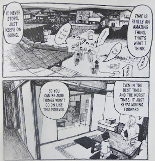
What's to be said about this magnificent series that will do it justice? If your only experience with manga is the action-oriented stories like Akira, then this will serve to demonstrate some of the diversity that exists in the Japanese comic scene as it is some distance from that style, as effective and as good as some of those comics are.

Sunny is set in the 1970s in a special Japanese orphanage. This type of orphanage is one where the children's parents are not necessarily deceased but, for one reason or another, cannot look after their offspring. Each chapter focuses on one of the children and over time we build up a picture of them, their feelings and emotions and how they cope with knowing their parents are out there.

In this volume, we're treated to a story about my favourite, Haruo, a tough and troublesome kid who carries around a jar of Nivea as the smell reminds him of his mother. We also see Sei, a character we were introduced to in the first chapter of volume one. He's a lovely, studious boy always thinking his parents are coming back for him He took some time to settle down but eventually seems to have made something of a home from home for himself at the orphanage. Unfortunately it is the “from home” part of that statement that is still affecting Sei and which drives his actions in this section.

Next we have Junsuke who is in the orphanage with his sibling Shosuke. Junsuke is our cover star, depicted with that intense snotty nose that kids seem to get. Junsuke and Shosuke's mother is in hospital. We are never told what it is but the impression is that it is something serious. Again this is bittersweet as we see a young child trying to be tough but inevitably succumbing to his fears in a realistic manner, quietly crying somewhere quiet.

Children coping, adapting and learning is a bit of a theme, and nowhere is this demonstrated better than in Megumu's chapter, in which her aunt and uncle come to visit with the best of intentions. Megumu though is only a young girl and she struggles to cope with the complicated feelings that arise. Matsumoto shows a deft touch here as he depicts the aunt and uncle's reaction to Magumu's less than grateful behaviour.

There are a couple more stories in here equally as good. Stylistically this book just oozes the period, from the card the cover is printed on, to the lettering used for the title, to the depiction of the Datsun Sunny in a washed out yellow on the back cover. Inside the artist peppers the strips with little background details of 1970s Japanese culture which help immerse the reader in the setting. Most importantly it is printed in it's native form of right-to-left, so the pages do not lose any of the subtle balance they can when these books are changed to a western format.

All in all Sunny is a wonderful read and testament to the strength of the Japanese comics scene. It is at its most effective when you allow it to slowly build. Start with volume one and get to know these kids bit by bit. You'll find it's an emotional and rewarding experience.

Saturday, 12 September 2015

New Comics

Where the blogger writes about his newly received monthly package of comics from the nice people at Page 45 before he's even read them, although God knows why he thinks anybody would be interested. Anyway, let the inane babbling commence.

Leaf (Fantagrahics Books)

Creator: Daishu Ma

This is the Page 45 Comic Book of the Month for September '15 and the image of the cover does not do justice to the sheer beauty of this book. It's a lovely hardback, with the logo seen through a leaf-shaped cut out in the cover. This is a wordless comic and it is one I'm really looking forward to curling up with as we enter that best of seasons, autumn. Sat in a chair with the leaves falling in the garden outside, and a nice steaming mug of hot chocolate to hand, this book open on my lap. A quick glance at the interior shows that, aesthetically at least, it pushes all the right buttons.

Loki Agent of Asgard #17 (Marvel)

Writer: Al Ewing
Artist: Lee Garbett
Colour Artist: Antonio Fabela
Letters: Clayton Cowles

This has been a fantastic series but looking at the editorial on the back page, this is the concluding issue. A great shame and this is a comic I'm really going to miss. Still better to go out whilst it is still on top form and the creators have not tired of it. There is one thing I'm certain of and that is the creators will deliver a conclusion that satisfies on every level. I've every faith in them.
Ms Marvel #17 (Marvel)

Writer: G. Willow Wilson
Artist: Adrian Alphona
Colour Art: Ian Herring
Letters: Joe Caramagna
Cover: Kris Anka

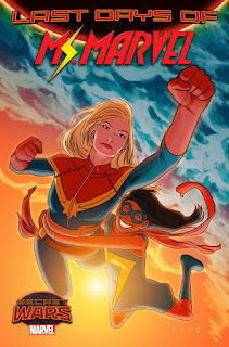
This is the other super-hero comic that I get regularly every month, and shares with Loki a sense of fun. Last issue Carol Danvers had turned up to lend a hand so it will be interesting to see how Kamala handles meeting her hero. This comic has not once let me down in the previous sixteen issues in terms of the entertainment it offers. Young and modern with a strong female lead, this shows just how good this genre can be. The fact that the likeable young hero is also a Muslim, realistically portrayed, adds an extra layer of meaning and importance which never turn didactic.
Providence #3 and #4 (Avatar)

Story: Alan Moore
Art: Jacen Burrows
Colour: Juan Rodriguez
Letters: Kurt Hathaway

 I'm a huge Lovecraft fan and was first turned onto him when Alan Moore mentioned the writer as a key influence in an interview sometime in the mid-eighties, so I had high expectations when this series began to be publicised. The first two issues have not disappointed. This is a dense read, with a  lot of allusions to various Lovecraft stories, and a huge amount of information that helps place you in this world (there are quite long text excerpts from the protagonist's journal at the end of each of the first two issues. Given the rather understated covers we have had, I'm rather disappointed with the cover to issue three and the picture of Dagon rising out of the water. Lovecraft is at his strongest when the horrors are hidden just out of sight, when you can feel there is something slightly out of kilter with the world but can't quite place it. Still I'm hopeful the interior will continue the high standards set so far.

Rachel Rising #36 (Abstract Studio)

Creator: Terry Moore

A lovely cover, as ever with Terry Moore. Each of these issues just flies by when your reading it, so that you are surprised when you get to the end so quickly, and a little disappointed that you now have to leave the world he has created for another six weeks. He has the knack of making you want more every time, a trick he established quite early on in Strangers in Paradise and has perfected through Echo and now Rachel Rising. There was a point some time ago when it looked like he wasn't going to be able to carry on with this title as it was not economically viable. Now we are onto issue thirty six I'm really hoping that things have turned around because comics of this quality are always needed.
The Fade Out #8 (Image)

Creators: Ed Brubaker and Sean Phillips
Colours: Elizabeth Breitweiser

This is Ed Brubaker and Sean Phillips. What more needs to be said? I think they are in the upper echelons of creative teams working in English language comics today. In thirty years time I think we'll be looking back on them and their work with the same regard comics fandom has for Lee and Kirby and their run on Fantastic Four (a regard I don't share but that's a purely personal issue). This is lovingly packaged with an image of a still from a film at the back which helps make this world they've created all the more believable.
Velvet #11 (Image)

Writer: Ed Brubaker
Artist: Steve Epting
Colours: Elizabeth Breitweiser

Ed Brubaker again, this time with Steve Epting. I think we are now entering the conclusion of the story that started in issue one, and hopefully by the end of this arc we will have a lot of our questions answered. I don't know if it will work out well for our heroine. I hope it does but I don't expect it will do. That just wouldn't fit the overall tone and I think Velvet may well be left more emotionally damaged than she was at the start. On a personal note I had a quick glance at the letters page and the letter I sent a while ago has been printed. The internet is fine but there's nothing like seeing your name in print in the actual comic to make you grin all over like a loon.
Sunny Volume 5 (Viz Media)

Creator: Taiyo Matsumoto

Volume one was a Page 45 Comic Book of the Month and I'm so glad it was as it introduced me to one of the most entertaining, moving comcs I've read. If you think of manga as all constant action-oriented, fast paced stuff the this will change your mind. It's about an orphanage in Japan where children are sent, not because their parents have dies, but because their parents don't want them or can't cope with them anymore. The concept sounds sad but instead results in really inspiring tales. There is no melodrama here, and there are no dire threats  to the kids. These are tales of the childen's emotional ups and downs in their day-to-day lives and its wonderful.

Thursday, 3 September 2015

Comic Bytes

Some little bite-size reviews/comments. So with a little nod to the Fast Show, this week I have mostly been reading:
Loki Agent of Asgard #16

Writer: Al Ewing
Artist: Lee Garbett
Colour Artist: Atonio Fabela
Letterer: Clayton Cowles

 This carries on in the same light-hearted, fun fashion already established, as the battle between the forces of Asgard and the old Loki and his allies comes to a conclusion of sorts, in which the new Loki has a decisive part to play. It's not often a super-hero comic makes me smile when I'm reading it nowadays (they all seem so serious, po-faced and grim) but Loki, together with Ms Marvel, has me grinning from ear to ear. Take this from Sigurd the First Hero to Queen Freyja and the other deceased Asgardian gods:

Sigurd: We also bring tokens of our fealty from our long sojourn on Midgard.

Sigurd: The mortals believe these, when worn, confer the heroic magic know as...”cool.”

Queen Freyja (donning sunglasses): I see. Well then heroes...let us ride.

If that doesn't at least raise a little smirk then you officially have no sense of humour.

Beneath all this there seems to be a serious comment on the modern day insistence on binary stances which allow for no shades of grey, no overlapping on any Venn diagrams (e.g. you're either Tory or Labour, football managers are either great, when they're winning, or awful, when they lose, etc.) Loki is neither for one side nor the other. There's also appears to be some meta-textual theme being played with here with Loki as the god of stories. We'll see how that develops but it is being handled with a delightful lightness of touch, which is something Ales Kot needs to develop. This leads nicely into the other comic I've been reading this week.

Zero Volume 4: Who By Fire

Writer: Ales Kot
Artists: Ian Bertram
      Stathis Tsemberlidis
      Robert Sammelin
      Tula Lotay
Colours: Jordie Bellaire
Letters: Clayton Cowles

This has been a good series, and this is an interesting conclusion. What it all means I have no idea and will spend some time mulling it over. This started out as a science fiction war/black ops book rooted in the international political situation of current times. The use of different artists throughout has been well handled and added to the overall effect the book had on the reader. This final collection changes none of that but adds a strange meta-textual twist to it as it intertwines the tale with William Burroughs, who appears to be writing the tale, or some of the tale, or commenting on the tale with Allen Ginsberg. All the while there is a metaphor for the violence inherent in man, and whether this can be removed or is something we need to learn to accept and learn to live with and limit. The shift is slightly jarring but one has to believe that the writer had it in mind from the beginning.

There is little doubt that Ales Kot is an ambitious writer, striving to move the comics form on, and Zero has been largely a successful series. The main fault I find with this concluding volume is that it reads less like moving the form forward, and more like moving it back to ape the worst of Grant Morrison's excesses. There is also a fault with the series overall in that humour is definitely lacking. Even in the heaviest tale, in fact especially in the heaviest, darkest stories, you need that humour to help lighten things. It gives the reader a sense of relief and, more importantly, it serves to emphasise the darkness, to make it more effective, by acting as a contrast. It's an old trick (Shakespeare used it in every tragedy he wrote) but it works and works well. Without it a book can start to feel dragged down by the weight of it's own portentousness.

All this is not to say that Zero is a bad book. It is well worth picking up and has some fine moments, but don't expect too much from the whole package. Definitely a case of the parts outweighing the while, but having said that most of the parts are damn good.


Monday, 31 August 2015

Corto Maltese: Beyond the Windy Isles (IDW)

Creator: Hugo Pratt

There is a huge problem when trying to write about a comic strip that is almost legendary within the industry. How do you approach something that is so highly regarded? How do you find something new to say about it? I don't have an answer to any of those questions so my solution is to just jump right in and offer my opinions, for what they are worth, on the second of the IDW Corto Maltese collections, Beyond the Windy Isles.

A little background on this first. Beyond the Windy Isles is actually the fourth in the series but IDW decided to start these collections with the third volume, Under the Sign of Capricorn. In an interview with the editor Dean Mulaney on the Comic Book Resources website here, he reveals that the reason for this is that it is with the third book that he developed the themes and characters that recur throughout. Having never read this series before I cannot speculate on whether this is a good decision or not. We'll only know when all twelve have been published, but I certainly didn't feel like I was missing anything when I read the Capricorn volume. Indeed it has been a strength of both the books released so far that you could pick either up and enjoy the stories inside.

So what of the book itself? Well physically it is a lovely object. The cover is a nice heavy card with a nice little picture of Corto Maltese against a map of the Caribbean. Inside the front cover is an informative introduction to book with actual period photographs of one of the locations featured in the stories. Opening this out displays a beautifully reproduced old map of the Caribbean. Solid to hold, printed on high quality paper and with a shot biography of Hugo Pratt in the inside back cover, initial impressions when you first pick this up and leaf through it are high. This feels like a quality book.

The packaging is all very well but what really matters is the quality of the stories. It's not much use a book feeling high quality only to feature strips that don't live up to the presentation. Fortunately each of the five tales are wonderful and an improvement on Under the Sign of Capricorn. The strips in that earlier volume where not poor by any stretch of the imagination, but these just seem a step up. Maybe it's just that I'm now more familiar with the Corto Maltese world but I was completely engrossed in these from page one.

There is a strong theme of betrayal that seems to run through the first four chapters here. The first story, Mushroom Head, deals with Corto Maltese regaining his lost memory but also manages to include betrayal and racial identity confusion. The second chapter, Banana Conga, opens with an incredibly effective page showing mainly two gun barrels with the wielders only present in their dialogue. We're then into the politics of a small island with double-crosses galore, all over a suitcase that everybody wants. In Voodoo for the President we are again embroiled in the corrupt politics of an island state, and are treated to the welcome return of two characters we first met in Capricorn. Sweet Dream Lagoon once more deals with the subject of betrayal as we are introduced to the disease induced hallucinations and dreams of a World War 1 desserter, in probably the most touching story in the collection, although that is possibly rivalled by the final story, A Tale of Two Grandfathers. In this we see the journey to recover a European boy from an island tribe where he has grown up, and asks the question of whether European “civilisation” is the best fit for everybody and what we should have been imposing on the world.

Words cannot really convey just what a job Hugo Pratt does in telling these stories. There is an elegance to his storytelling that is almost the polar opposite of the Jack Kirby over the top, in your face action style. Not that one is superior to the other – they are just different approaches which fit the different stories. In cinematic terms it's a bit like the difference between a Luc Besson directed adventure film and a Stephen Spielberg directed one. The influence of Milton Caniff shines through, as does a strong feeling of his contemporary Alex Toth in the work. Each page feels well balanced, and the action is captured clearly. There's no ambiguity here, no wondering what is going on, or who is shooting at whom. There is no elaborate page design on display either, with all sorts of different shaped panels laid out in dramatic arrangements. This is a strict grid structure. Nevertheless Pratt manages to convey the drama in each scene by what the objects he chooses and the angles he draws them from. The aforementioned opening to chapter two is a case in point.

Corto Maltese is a strip that lives up to its status, and IDW are doing a fine job in their packaging of this very special material. Roll on the release of the next volume, Celtic Tales.

Sunday, 23 August 2015

Tim Ginger (Top Shelf Productions)


A Page 45 Comic Book of the Month
Creator: Julian Hanshaw

“Live the life you love...Choose a god you trust. And don't take it all so seriously.”

Ostensibly this comic is about a former test pilot who thinks he saw something on one of his flights and who lost his wife to an early death. However it is really a book that has a deep and profound theme applicable to almost every adult in the western world over the age of thirty. We must let go of the past to allow progress to a happier future. We don't forget the past and the people and places we knew, but they cease to act as a chain tethering us to something we can never return to.

In between the main tale are excerpts from a comic written by an old female colleague and object of mild flirtation, Anna. These all deal with people who decided not to have children, their reasons why and reactions to sometimes passive-aggressive queries as to why they have made this choice. These parts of the comic, whilst entertaining, don't really seem to add anything to it. I'd have liked them to act as a sort of comment on the main narrative, the classic example being the pirate comic excerpts in Watchmen, but they don't seem to function in this way, or if they do I'm missing it. In and of themselves however they are well designed, with a change to black and white and a page design that makes it appear you have just left the current comic and opened Anna's book yourself.

Overall this is a lovely book with a touching story. There is a hint of Kevin Huizenga about the art, especially in the opening aspect-to-aspect panel transitions, the occasional focus on wildlife, which to my mind acts as metaphor for the internal struggles of our protagonist, and in the line. Colour is s strong point too, with a very tight palette used effectively to indicate both time and place.

One final comment on the lettering. I like those subtle details which work on a subconscious level whilst you're reading, and there are a couple of these. The first is what appears to be a slight change to a more formal style when Tim and Anna first say hello when getting reacquainted over a cup of coffee after they have met again at a convention. Following the intial greetings, where they must have been nervous and slightly apprehensive, the lettering quickly returns to the more informal style which looks almost like handwriting and contributes to the feeling of intimacy we have with the tale. The second is where Tim's agent tries to start chatting Anna up, to which her exasperated “REALLY?” is all in upper-case. Small details but they help communicate the feelings of the characters in a very efficient and effective way.

There is a message that comes through strongly. We are all made of the stars, and a glimpse of the universe lets him know we are all connected, and out in the desert under in the almost total darkness you can see so much more of the universe than under the urban light-polluted sky. Don't be scared of the dark times. Once accepted they will help you to see the light that much better, and it can be quite majestic.