Monday, 24 October 2011

Optic Nerve #12 (Drawn & Quarterly)

Creator: Adrian Tomine

Given how rarely it comes out and the unwavering quality of the title, a new issue of Adrian Tomine's Optic Nerve is something of an event.   The previous issue was the conclusion to the Shortcomings storyline back in, I think, 2007. Unfortunately this issue has two self-contained stories which suggests that it may be some time before another issue hits the shops. Still let's console ourselves with the issue to hand, and the two main strips within. Two completely different stories which still maintain that feeling of warmth and humanity which the artist manages to convey in virtually all of his work.

The first of these strips, a scene from which adorns the cover, is titled "A Brief History of the Art Form Known as 'Hortisculpture'". A rather clumsy and slightly pretentious title which fits perfectly with the narrative. Harold is a gardener disillusioned with his job who takes an idea from an article about a Japanese artist, and creates a new art form from it that he calls Hortisculpture. Basically it takes sculpture and entwines it with living plants. Well-meaning but not exactly blessed with any artistic talent, Harold is blinded to the folly of his ugly creations and the infeasibility of anybody paying to buy these monstrosities and then paying him a maintenance fee to look after them. Like plenty of people without any real understanding of art he conflates the creation of great (as he sees it) art with great material wealth. Hortisculpture begins to dominate his life, and that of his supportive wife. It is not until he hears his daughter trying to defend his pieces to one of her friends that Harold is able to realise that the idea is a non starter.

Tomine tells this story as if it is a newspaper strip, four panels for six instalments and then a full page colour strip for the seventh. The style he employs also seems somewhat different to previous work but is in keeping with this approach, and it is resolutely still very recognisably him. He skilfully pull this off, the delivery making it seem effortless until one thinks of the amount of work that must have gone in to ensuring that every four panels contained a satisfying story within itself. His use of dialogue to conclude each four-panel instalment is just as impressive, as at the end of a sequence which sees him complaining to his wife in bed after he's just offended her father:

Different style of art and some sublime dialogue
Wonderful stuff.

The second of the main strips is called "Amber Sweet" and concerns a young woman who is forced to drop out of college and endures verbal abuse due to the unfortunate fact that she looks like a porn star called Amber Sweet. This is presented in a more traditional comic book form, and Tomine's art here reminds me a lot of Chris Ware without the innovative page design that Ware brings to all his work. It is lovely to look at, but for me this is by far the weaker of the two strips. 

The artist appears to be trying to say something about the objectification of women by porn but is rather confused. This is not surprising as it's a difficult area. In some cases it seems obvious that it does, but then what about the women who like porn and who make the films themselves as directors designed to appeal women? As a man it is sometimes difficult to form a coherent conclusion to this subject without feeling that maybe your argument is being tainted by guilt at enjoying possible exploitation. Whatever the reasons, this story feels  a little shallow and on rereading is a bit of a disappointment.

The issue is rounded out with a letters page which is very entertaining, including two letters from somebody convinced that Tomine has ripped off his ideas for Shortcomings, and an amusing two page strip showing the respect the single issue comic book form gets now that "graphic novels" have taken off so successfully.

All in all this is an issue that deserves your hard-earned time and money. Even the slightly disappointing Amber Sweet still provides eye candy if you like the ligne-clair style.

Saturday, 22 October 2011

Rachel Rising #1  (Abstract Studio)

Creator: Terry Moore


A woman walks through a forest to a ditch and watches as another female rises from the ground as if buried alive. The just-buried girl walks home and then tries to figure out what happened to her. She has a mark around her throat that her memory, which is extremely unreliable, indicates is a rope that was used to strangle her. Her eyes are very strange and her cat is afraid of her. Finally she is told that she is not who she thinks she is - she is not Rachel. Thus ends issue one.

Hot on the heels of the rather magnificent science fiction series, Echo, comes this seeming horror/mystery title from Terry Moore. Mr. Moore uses an effective narrative device here as the main protagonist is as clueless as the reader as to the events that led up to the start of the book. We learn as she learns, and at the end of the first issue this reader really wanted to get straight into the next issue to learn more about this girl and the whole mystery. Fortunately as I was late getting onto this series, my comic shop sent both issues one and two together (thanks Page 45). Sometimes being slow off the mark can have its advantages.

The second issue cranks the mystery up and expands on Rachel's world as she goes to visit her Aunt Johnny, who works at a mortuary and is a little mentally unstable. We get the impression that Rachel is dead as he lumps her in with all the other apparitions of dead people that he experiences whilst working in the mortuary at night. The mysterious woman from the start of issue one turns up again and encounters a sweet little girl, who suddenly turns extremely violent after the visit. We leave the issue with two questions - what has happened to Rachel and who is this mysterious woman?

Let me first say that I have always admired and enjoyed Terry Moore's work, from Strangers in Paradise through Echo and now onto Rachel Rising. He is an extremely talented cartoonist and his art is an unalloyed joy to look at. His storytelling technique is top level, and he always manages to leave you finishing an issue and wanting the next one immediately (something I've experienced with every Moore comic I have ever read). I do have one problem - his depictions of women.

Terry Moore's women all look stunningly beautiful, although not in a cheesecake style. The problem is that they all look very similar and it can sometimes be difficult to tell one blond from another. That causes some very minor problems here as I'm not sure if the mysterious woman is in some way Rachel, or whether she just looks like Rachel because they both have blond hair. It detracts a little from the enjoyment when you don't know whether something is as it is actually depicted, or if this is because of limitations of the artist.

That final criticism is very minor though, as this is shaping up very promisingly and looks, at this early stage, like it could at least be the equal of Echo and Strangers in Paradise, although it is closer in feel to the more recent strip. You owe it to yourselves as lovers of fine comics to pick this up either in the individual issues or when the trade is issued. If you can wait for the trade then it will read even better than it does now, but I can't wait that long and have to get as much as I can of this story as soon as is possible.

Thursday, 13 October 2011

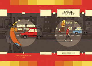
Some People (Self Published)

A Page 45 Comic Book of the Month

Created by: Luke Pearson

Let's get this out of the way first. This comic is four pages of strip, with a couple more of development sketches and notes, and cost me £2.00. It is also free on-line. Despite all this, I have to say that £2.00 is a bargain and you should all go out and buy it now (Page 45 may still have some copies).

The artist quite clearly states in his introduction that you can go to his website and print out as many copies as you want. However £2.00 will provide support for an extremely promising UK creator to create more high quality work, and you can never have too much of that.

This is a clever little strip, showing how we are all "some people" and we are all in some way linked together. We start with a young man being abused by a youth wearing an outfit designed to strike fear into the Daily Mail readers amongst us, a hoodie. We then see this youth ageing to become a cuddly Grandad to a little girl, who then ages to become a bitter single mother with a daughter of her own whose classmate...

You can see how this is going. Luke Pearson introduces us to each character for four panels, time passes and we get a link to another person, until eventually we come back round to the young lad from the start as a disillusioned middle aged man spending all his time at the pub rather than with his family. The underlying theme is similar to Ray Fawkes' more ambitious One Soul, and it is remarkable how much empathy the artist elicits from the reader for these characters that we meet for only a brief period.

In his introduction, Luke Pearson says, "If I was to die right now, this is what most people would know me for.". I have to say that if that was to have happened, we would be mourning the loss of such huge potential. As I write this I have learned that he has a new book out called Everything We Miss published by Nobrow (a review of which you can find by the ever reliable Stephen Holland here) so with a bit of luck we have plenty more work to look forward to.

Wednesday, 12 October 2011

Criminal Macabre/The Goon: When Freaks Collide (Dark Horse)

Now I really didn't want the first post in this blog to be negative, so I chose this one shot. Having enjoyed Criminal Macabre in the past, and being a big fan of Eric Powell's The Goon, I felt that this would be a sure thing. How wrong I was.

Firstly the positive points. The cover is a nice piece of work by Fiona Staples, capturing the feel of the four characters presented. Inside The Goon and Franky are given some wonderful dialogue, and there is nice interplay between Franky and Mo'Lock.

Steve Niles as the writer does a fair job of establishing the situation and characters. The first page tells us that there is a war between werewolves and vampires in a Chicago not quite of this dimension. He shows Cal Macabre and The Goon doing what they do, which is beating up monsters. This isn't the most sophisticated comic in the world, but then again it's not supposed to be, and the plot would work well.

Unfortunately the interior art by Chrisopher Mitten just isn't up to standard here. There is no clarity at all, no attempt to establish a scene. For instance, there is a scene where Franky and Mo'Lock are speaking to each other whilst Goon and Cal are fighting, is a parody of the super-hero team up cliche, when this exchange occurs:

Franky: Speak of the Devil! Look at that! What kind of freaky place did we wind up at?
Mo'Lock: I do not know, but men wearing cloaks are rarely a good thing.

However there is no sign of any man wearing a cloak in the panel, just a heap of boxes. Eventually Franky and Mo'Lock catch the cloaked man that we didn't see, and he lasts approximately eight panels before exploding. Why he explodes is not adequately explained, nor does his role in the story make much sense. Apparently he just woke up and things he thought about came real. The blame for this confusion can't be laid at the door of the artist, and sits squarely with the writer.

After this there is a little bit of fighting, although the werewolves and vampires appear to be in it together, a book is destroyed sending away some inter-dimensional entities (I assume - it is never made clear) and Hellboy turns up, which means nothing to anybody who doesn't follow Hellboy, and so leaves a very unsatisfying conclusion to a confusing mess of a story.